Experts Warn Against Using These 4 Color Combinations in Your Home Decor
Curious about which color combinations to avoid in your home decor? You’re not alone in grappling with this common decorating dilemma. While certain color pairings may seem appealing, they can often clash or disrupt the overall aesthetic of your space.
To provide clarity on these incompatible combinations, we consulted experts who shared their insights on color pairings to steer clear of, as well as recommended alternatives to achieve harmonious design schemes.
- STEER CLEAR OF PINK AND BLACK; OPT FOR PINK AND NEUTRALS INSTEAD Pink and black may initially seem like a bold and stylish choice for color blocking, but when used excessively, they can create a harsh contrast that feels visually unsettling. Instead, consider pairing pink with neutral tones such as grays, creams, and dark chocolates for a more balanced and visually pleasing effect. Additionally, pink pairs well with a wide range of colors, offering endless possibilities for creating a cohesive and inviting space.
- AVOID ORANGE AND YELLOW; CONSIDER ORANGE AND BROWN INSTEAD While orange and yellow are vibrant and inviting colors individually, combining them in their bright forms can create a visually overwhelming look. To achieve a more calming palette, pair orange with rich browns, deep navies, or dark greens. These earthy tones complement orange beautifully and create a warm and inviting atmosphere.
- SKIP PURPLE AND ORANGE; OPT FOR PURPLE AND PINK INSTEAD Purple and orange may clash when paired together, creating a disjointed and jarring effect. Instead, opt for softer palettes featuring shades of purple such as eggplant, lavender, and lilac. These natural hues create a timeless and soothing ambiance, perfect for cultivating feelings of joy and calmness in your space.
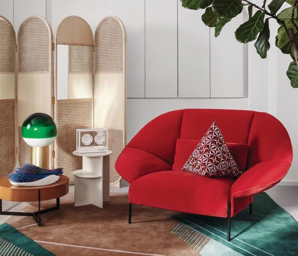
- AVOID RED AND GREEN; TRY RED AND GRAY INSTEAD While red and green are quintessential holiday color, they can feel overly festive and out of place in year-round home decor. Instead, pair red with neutral tones like charcoal gray to create a sophisticated and visually striking look. Gray helps to balance and enhance the boldness of red, resulting in a chic and modern interior aesthetic.
Remember, if you’re set on using certain colors together, there are ways to play around with different shades and tones to achieve a cohesive and harmonious look. By avoiding primary colors and experimenting with subtle variations, you can create a space that feels both stylish and timeless.
Repurposed article originally published in Living etc